About that dashboard update…
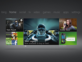
 So, ahhh… about that dashboard update. What gives, man? I feel like someone has gone into my room and reorganized everything. And it’s not like that person did a poor job of reorganizing, but the way I had it set up before wasn’t too bad either.
We see what we want to see
Or what Microsoft wants us to see, which are advertisements and billboards leading us into buying things from their online marketplaces. Just about every screen has an ad on it, and the largest tile on each page is linked to an Xbox service (marketplace, zune, dlc, etc.). So where’s Hulu and Netflix? On the Video tab, obviously… you would be wrong sir (or madam). It’s in the Apps screen. Ok fine, I also heard that my Xbox was going to be magically transformed into a cable box with content the likes of SyFy. Sorry, that’s not currently available either. Sigh…
A more streamlined experience
Ok listen, the Xbox has no fewer than 4 ways to access music on the system. You can listen to music through the archaic media player, or through the media center interface, or through zune, and don’t forget about last.fm. But you know what I can’t do… I cannot access the music on my computer (by the way, much of which has been acquired through the Zune PC software) via the actual Zune interface on my Xbox 360. Granted, there are plenty of other things available to the user — like voice search for the music you want to hear, set up a queue, pin things, etc. That’s all great, but I feel like someone could make the argument that the previous dashboard layout was quite alright, and while this one is snazzy, it doesn’t address the problems or requests that people had prior.
So what you want?
If you’re a sports fan, for example, the strongest offering is still College Football. But alas, ESPN is a flagship app on the system but you do not get Monday Night Football. PS3 has portals to sports such as NFL and NHL. Of course, you still need to be a subscriber to those services but you still get it. You can’t tell me that there aren’t people out there who would pay a premium for access to an MNF ticket through the Xbox ESPN app. In this cut the cord era, where people are leaning on Netflix, Amazon VOD, and Hulu for their television, there is a missed opportunity here.
What about Amazon video access… ok that probably won’t happen as long as the Zune marketplace is around. But YouTube is promised in the future, they have movies, as does Netflix and Hulu.
And those “tv” style ads on the main screens… what are gold subscribers paying for exactly? Someone made a comment on a forum somewhere that Gold subscribers shouldn’t see ads as long as they remain paid. That’s a tough call, as Hulu Plus subscribers see ads, but at the same time PS3 members can play online for free. It’s not the ads for DLC or Zune content that I take exception to either, but rather the animated video ads that appear on some screens as if I were watching TV. In the previous dashboard design those could be easily skipped over while flipping through tiles on a screen, but they seem to be more unavoidable here.
What do you think?
It’s not to say that the entire dashboard update is all bad. Microsoft is working on voice search integration, and better Kinect support for navigation. The dashboard update also coincides with the redesign of the xbox.com website, as well as an iOS app that brings a WP7 experience for Xbox enthusiasts. Finally, the Beacon system provides a streamlined process for getting friends together to play online, which seems like a feature that should have been in the console from the start — but there you have it.
We are interested to know what you think about the dashboard update? Love it, hate it? Is there still something missing that you want… or did you get exactly what you needed from the latest overhaul?
Or, maybe in 2 weeks we’ll all forget the previous iteration ever existed…
Happy Gaming.


